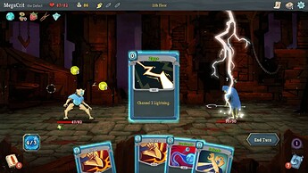
For anyone that doesn't want to do full runs: You can press '0' to kill all enemies on screen.
After a quick meeting with the game design consultant @CulturedUrbanite, we have decided to release a balance hotfix to the demo:
Added new starting test Item: Ring of Balance. (Adds a Balance Jewel, No effect)
This allows experiencing the game at a higher board scale (7x7) and comparing the statistical effects.
Playing the game with the "Ring of Balance" is a vastly different experience, I highly encourage everyone to try a run with and and a run without the ring - and give feedback.
That being said, I have personally confirmed that it is possible to finish the demo with and without the ring.
Currently next on the list is fundamental changes to the dungeon levels generation and enemy movement (They haven't changed since the demo 2 weeks ago) and increasing battle board complexity (More statistical analysis required here).
Could you explain barbaric items?
I haven't found any use for them.
Not all items are meant to be good or useful currently. The main idea behind having items in general is to allow for pre-encounter decision making to set up your character's stats and gem pool appropriately.
For example, not every fight requires armor, as some enemy attacks are "Magic Damage" (dota reference), and if you already have a high armor stat - the negative armor trade-off might not be as bad.
Items in general are not the main focus of design currently, but that's the general idea.
The demo build accidentally had the second branch disabled (Right staircase after first level).
This will be hotfixed in a second.
When will Jilsen and Jones studio release a game with backstory?
Btw please tag me when new major builds go live. I don't read the 200 daily posts about transgender people in this thread but will come back and beat the game (current world champion speedrun record holder) as needed
Ok
Official Player Testers (unpaid):
@big_ass
@You_lose_i_win
I was paid.
Won't happen again.
I was watching SGDQ and you weren't there. I was really disappointed
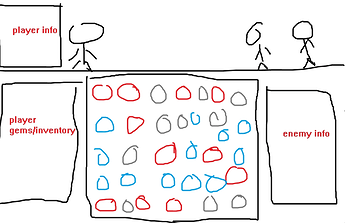
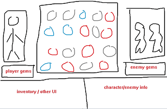
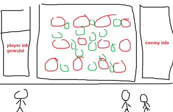
@CulturedUrbanite and I were discussing UI/Presentation adjustments. Would love to hear opinions on this.
Which do you prefer?
Style 1 (current):
Style 2:
Style 3:
I like 1 the most, 2 the second
I like the interaction element in 1/3, 2 is JRPGish but still look good
What is your goal with the current UI that is currently unmet?
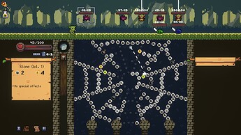
We feel like there's too little emphasis on the bejeweled board, and that the current style makes it seem too much like Peglin and Slay the spire
While I do agree with Jones, I have no best solution in mind, which is why I come to ask.
Yeah, that parts tough. I think you have some good reasons/concerns...I'd just focus on what you want out of the new UI. If not the bejeweled board then what is the focus, and how do you focus on it without tucking away the core bejeweled loop too much?
Honestly I think your current design approach works fine and with one of those 1-3 designs for your desktop experience you pretty much have the rest figured out. For better or worse the game is that bejeweled loop right. Might as well polish that
The issue is that we want the bejeweled board to be more in the focus, that's the whole point, and that the current UI seems uninspired.
