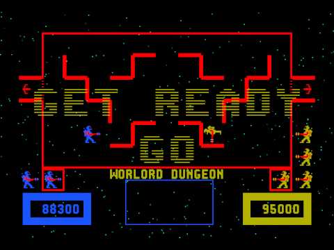
I added a similar key mechanic to Space Minotaur game which I never really liked: Collect keys to open a portal to advance to the next stage to fight minotaur. UX is difficult, which is why you should hire a professional.
Okay, someone messed with the screen aspect and now the score is offset wrong, but here's the main game loop of collecting keys. What do you think?
i like when theyre opt in to better loot or you only need so many keyshards to form a key and can like collect pieces when convenient
UX isn't hard, you're just stupid and incapable of thinking.
I think the "space minotaur" game would be better if each monster had flashing turn signals over them, designating where the enemy was going to move.
Your "minotaur" game would be far more interesting if it was an actual labyrinth or incorporated some thematic idea of "maintaining a single directional turn" or "bread crumbs".
Dropping a "player" to the bottom is bad and particularly kills the idea of "tilegenerator produces a branch, drop that branch to the bottom for selection".
As to how to initiate combat through the staircase system. Ideas:
-
Each monster has two color affinities, one color affinity clears it off the board without causing a battle, the other causes a battle. The AI for the monster would thus be something attempting to move toward a match3-battle affinity.
-
Have the monsters attempt to move to the bottom of the board as well. When they reach the bottom, you battle however many monsters have reached it this turn.
2 would reduce the amount of battles and add some difficulty with relative simplicty.
I have difficulty thinking about these kinds of things. Maybe it's not that I'm incapable of thinking but that I'm predisposed to investing a low amount of effort into thinking.
Thanks for the suggestions. I will get to work prototyping them.
in regards to a "labyrinth" feel, you have non-euclidean spaces where you turn left, turn left, turn left, turn left and don't end up where you're expecting to be. I think the core "idea" of a labyrinth is that you don't really end up knowing where you're going and there's quite a bit of room to have complexity arising from simplicity there.
What you have is an extremely polished cabinet game, which is nice and impressive, but doesn't do anything that pops to me.
That being said my "design choices" are suboptimal and have ruined "Jones and Jewels".
The level geometry seems to be what gives it "variety", what is changed to alter the gameplay.
There's probably something thematic you can play on with "labyrinth" and the level geometry to differentiate. Without thinking too hard, the player drops "Ariadne's string" which can't be crossed perpendicularly but can be backtracked over. The level geometry changes if you don't stick to a continuous wall or something.
If you're going to add a "key" element, it should be something like "rescues spacefarer who was to be sacrified to the minotaur", for thematic reasons.
What would a space labyrinth be? Navigating through a shifting asteroid field? An area where your sensors are unreliable because of intense radiation from a pulsar? Traveling through wormholes?
Rectilinear dungeon, apparently
ballpark an estimate of what it would cost to get that quality art (space Minotaur) from a freelancer online.
I basically run under the premise that the cost of UI elements adheres to an exponential curve; the 1st UI element costs nothing, the third one will cost me $100, the fifth one costs me $1k.
First, learn to draw -- it's not that hard, and a true intellect such as yourself should have a proficiency in the arts. Second, don't pay for art until you've built a prototype at the very least.
it's fantastic that this is your area of expertise but somehow you've still managed to be a worthless ■■■■■■.
You'd be surprised how many people aren't talented and get tons of opportunities.
I work five days a week mowing the lawns of defense contractors in 105F. Do you think I don't realize this.

