What were they thinking?
yeah we should really figure out how to pipe the sidebar to the right side of there in ember
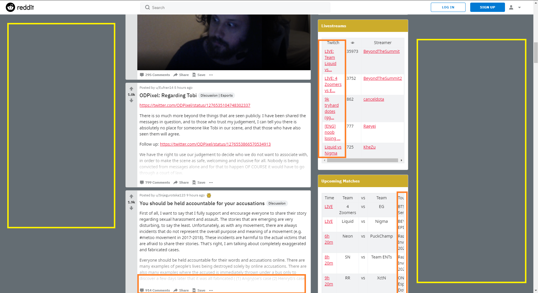
Left side: Big fucking Pla$ma ad, maybe multiple
1 Like
modern web design is so dog shit why should every website be coded to work on PCs tablets and phones just design it for my pc and make me scroll across the screen horizontally to read it on my phone like the good old days
deduplication of code
we have a fucking namafia app
nothing like the rush of figuring out you could use a website on your phone with severely limited functionality but still making it work
just zoom if you really wanna sidescroll
1 Like
I'm not rly commenting on this site in particular, but more the general trend
I see they are doing it for mobile
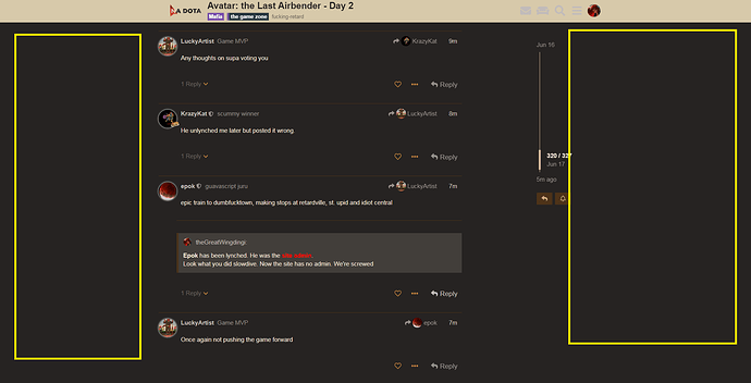
but thing is a lot of us have wide screens and this recent trend is to concentrate everything in the center of the screen at the expense of readability of all the content... and then have massive empty spaces on the edges. It's bad design imo, plenty (if not a majority) are still browsing on real monitor and it's objectively just worse than using all the available space
the issue of a lot of people wanting to make their web view into a mobile app is another thing entirely
I think the concentration on app-ifying everything is actually about farming people's data or other related dark patterns (aka "engagement")
or in this site's case just a fun excuse to make an app
![]() RESPONSIVE DESIGN
RESPONSIVE DESIGN ![]()
1 Like
i would rather buy the 1% of our users that use tablets and legacy iphones new devices than continue to test for that shit everytime
1 Like
but what about the IE11 users?!?!?!
I only visit this website on my phone