Invites for the Artifact League will close Tomorrow Night at Midnight
Actually i misread, I thought you meant mana 8 (round 5).
I think round 8 is a bit overkill yeah - Definitely something wrong, but I don’t know what it is.
Depends on what colors she’s playing iah
I just have this Habit of thinking that when games go on twice as long as the average (40 minute artifact game when a game is usually 20) then Usually both players are bad. (Like in dota when a game lasts 2 hours then both teams are retards most of the time)
I don’t know artifact well enough
I’m not saying you’re wrong. I think there’s just a lot of missing info about cards, and how drafting needs to flow in order to be effective. Everyone’s kinda talking like synergy is less important but I’m not sure how this translates. Perhaps that’s my problem as I try to create a deck that has its purpose but being pretty new to this I’m just not effective enough? I’ve picked up on some cool combos but I think ultimately I never seem to do enough damage. When I play damage decks I think I execute poorly (my strategy is geared too much for future turns and not at present strength?)
May be a product of playing blue black almost exclusively for most of my games until now
I opened an Axe in my starter packs, I’m pretty sure that proves I’m lucky enough to win this card game tournament.
Speaking of which, I’ve gotten wind of some insider information that Axecoin is going to skyrocket in value soon. Invest while you still can.
Can’t wait.
1 Like
24h til close
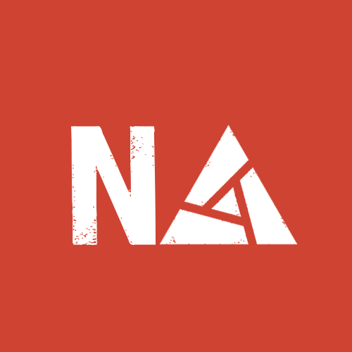
i was playing around with a logo for NArtifact but it's not that simple after all idk
it's missing something
4 Likes
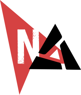
It’s missing the little triangle on the N in the nadota logo
1 Like
This is really good, but yeah, nma is right: it’s just missing the cursor over the N
Maybe instead of a full solid background you could have an intersection line and like two different colors
but it looks pretty good

i might be onto something here, the artifact logo just isn't A-shaped enough to read like a convincing NA
3 Likes
one more iteration
3 Likes
Try rotating the cursor clockwise and moving it down to cut off more of the N, also the N itself could be Wider (more similar to the one in the original logo) but who cares
I certainly don’t care
I care
Steal the N from this old logo

I like the splatter effect you added
Can you make the artifact logo part more dynamic by giving it some color - perhaps something like the grey effect you see on the A here