Yeah if you joined xazey
Sure tho will later
Yeah if you joined xazey
Sure tho will later
ty
i want my sub back
sub for a mafia game 
Test
i transferred all the styling ive been doing for the past few weeks to the dark design
What in the world
is something wrong?
the dark black top doesn’t work for dark theme. the logo needs a white version. it should stay the gray imo. or make new images. kinda like the gray tbh.
@SOPHIE things like this shouldn't be allowed or scaled to lineheight.
The changes ported from light are all way too bright for dark
I kind of thought you might be trolling
Yes I agree. I think you should revert dark theme to what it used to be yesterday, It was perfect - now it has way too many Jarring coloring issues.
I’m sure it was fine on Light but now theres red blue and black on the thread list page, and the lines to separate posts in the threads themselves are Bright White when the posts were already separated well enough by the colors
Why is that 1 new post circle red?
The color of this bar is also slightly out of place.
This white line should just be removed honestly
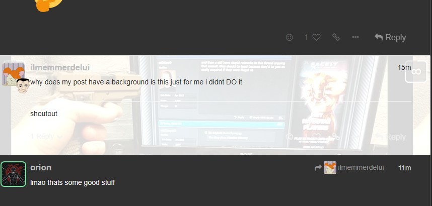
i just temporarily hid the casey background since its not styled to dark and and i want to fix the rest of the design.
the color of that bar is the original nadota color ported over. i think it looks alright there, you dont like it?
ill remove the white borders where its’ weird.
I don't know - it just looked weird, it's no big deal
This may be Nit picking but the two blues here should be the same color I think, and (1) circle shouldn't ahve that gray outline.

sure, those seem reasonable. fixing both.
Looks like a watermelon tbh