i dont like the design too much, so im working on some custom css to make it better. if you have any suggestions on things you’d like modified, let me know.
A few things i wanna do:
categories/topics alternate background color to distinguish (finished, test on dark test for now. will bring to light later)
topic view takes up more width on desktop
page container colors gutters of page
sidebar with content (not sure what kind, dont wanna rebuild that twitch live list but it might be in the future)
show user-preview on hover, or otherwise display post count/join date by default.
A few things id like help with:
try out mobile, let me know what could be fixed up there if its too busy.
id appreciate it if someone bothered to wayback machine nadota and got me a light/dark/mobile color palette of the site
for now im publishing CSS changes to “dark test”. when i get the nadota color palette ill try and apply it to their relative themes on dark versions. for now though theres only a dark test.
Morning slightly broke this morning. A lot of pop-ups (e.g. clicking on someone’s picture to get additional profile info) go off the side. And the reply box now goes off the side of the screen too. Wasn’t this way last night.
Any chance it’s got something to do with you? I have some custom CSS in the non-test skins but nothing that should be causingthat kind of an issue. looks okay to me when i click on something too.
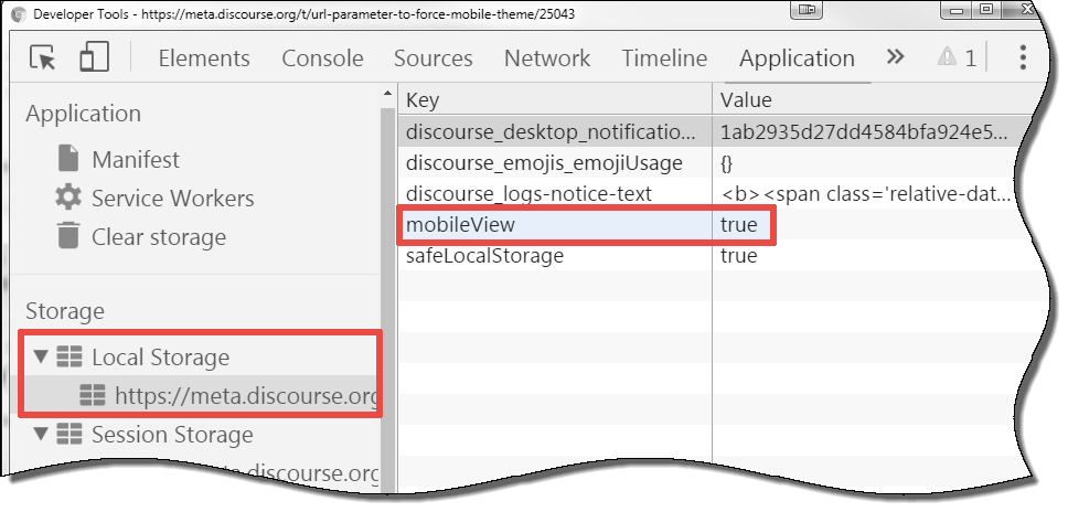
Also just noticed now that shrinking the page on desktop doesnt really default to mobile-friendly CSS…ill have to write some viewport specific junk for that.
On mobile, hitting reply to submit a post only works like 1/20th of the time. It’s not my phone: if I switch the site to desktop it always works immediately.
Now that I’m using it the designs a bit janky on here but everything’s still very spiffy. I might clean up the design later this month so it looks good to read for a mafia game.
One quick theme thing: have each post alternate shades of grey on the light skin. It makes it easier to read; I’ve done that for a lot of stuff I’ve developed (I’ll look up the hex codes when I’m back in the office Thursday).
Actually, the two shades alternating for threads are the two I'd have posts alternate. It makes it look a lot cleaner when each post doesn't have its own box