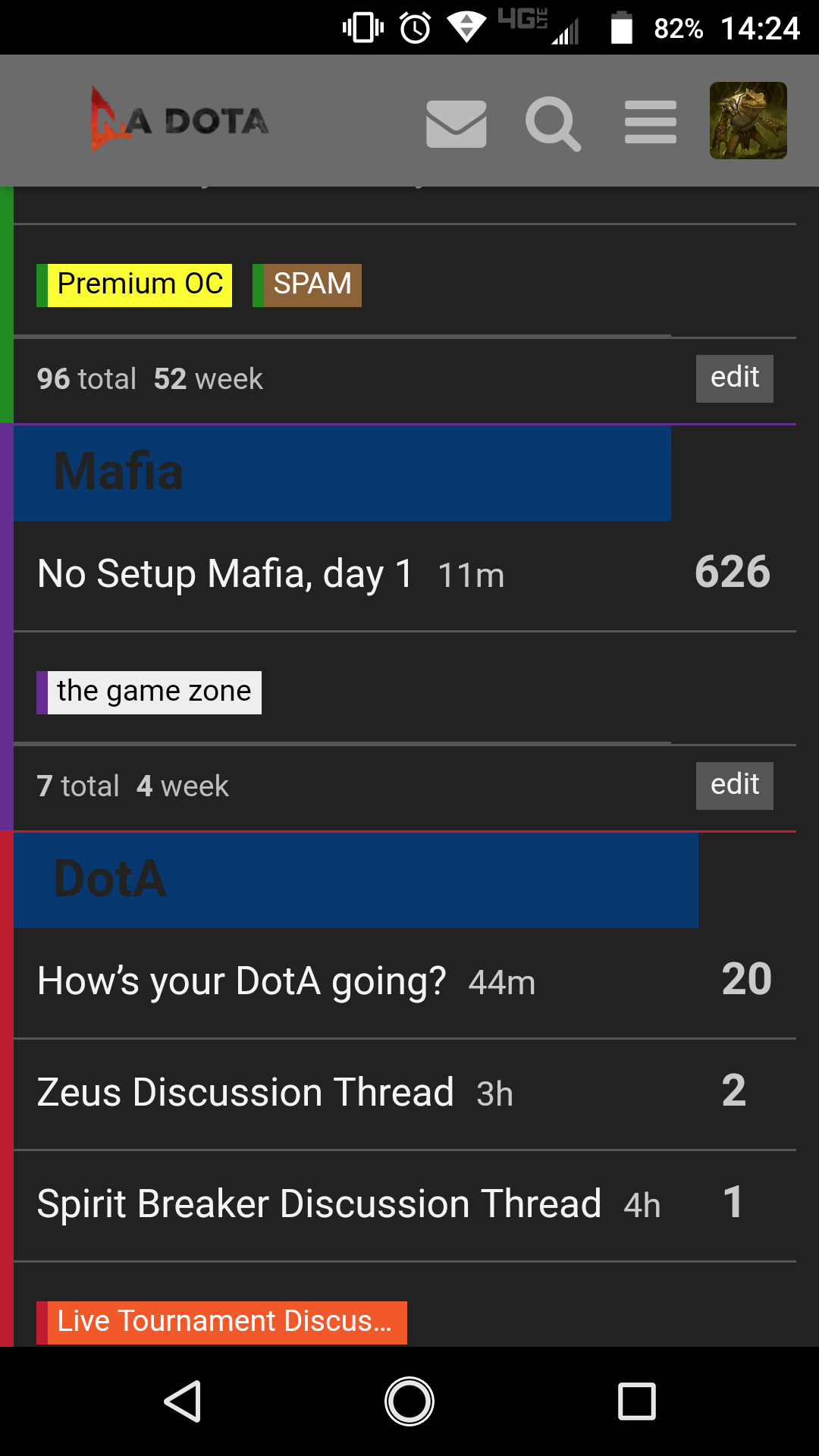
I don’t like the blue categories on dark mobile.
1 Like
Seems odd or wrong shade.
1 Like
.
2 Likes
Yes, all of the colors are off. Colors that look good on a white background are not necessarily going to look good on a dark bg. Just needs to be tweaked a bit.
1 Like
I think @SOPHIE shoulda made a test dark theme before changing the current one.
1 Like
yeah. I’d just grab a screenshot of the old/new and then pull in colors that work from each. The colors on the home page are too dark as well.
I can help with this late today/tomorrow morning at latest if u want input from one of the 3 people who actually use dark
1 Like
can we get the weird jellybean contoured buttons and pinstriping back
1 Like
Can you screenshot this
1 Like
I think he’s talking about the old Nadota VB buttons. not sure
I think it’s important to have a test style with all of the best ideas tried so far (watermelon notifications, jellybean buttons, casey background) so that these important features can be delivered to specific users when needed
1 Like
I wish I had it. let’s see.
1 Like
“Jelly Bean Button” in the thumbnail here
i set up dark old theme which is the plain dark theme no customization.
the blue forums title bar needs little stripes going diagonally + a glossy finish
Fuck flat design. Give me that thicc site layout
Perfect - I’ll have a look at new dark again later and get back to dan about what’s worth keeping
Can probably just poll the 2 dark users for what they like
Personally I want a really mellow forum experience so that’s why I was so offended by the new, bright colors
shoutout nicolas j checkers