the ui problem is seeing spiderman and circus show up
The UI has no problems? It's the worst card game UI I've ever seen
You're wrong.
The "lanes" are small - once a card is down on the board, I am kind of struggling to see what card it is. The board animations don't help, they kind of obscure the actual card. The card art design is not great - look up the analyses by several people about how good card art is made (it's about emphasizing key features in order to make the card easily identifiable at a glance) - here, the cards and art is visually a mess. You're working really hard to see what's on the board.
I understand the cards have a mana cost and strength/attack value. You get more mana to spend each turn. The lanes have effects that change the gameplay. I've no idea why the screen is shaped the way it is, I assume lifecoach is partially responsible (it's awful - complete nonsense from a UX perspective).
The worst offender, though, is the individual cards themselves. You have no chance as a casual viewer of figuring out what the cards do - at least in other games the streamer will hover over cards and you'll see the effects, when card hits the board there will be clear animations that make it obvious what it did - here they've made the whole card be art (as before, not particularly clean art) - the names are always different colors, don't stand out well from the background (once again I'm working harder than I should have to to figure out what I'm looking at) - only chance of learning the effect is if streamer accidentally clicks a card to open its description, which most streamers will never do because they know their own cards after an hour or two.
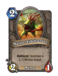
And the animations are just kind of random/chaotic. In HS when a card hits the board you see what it does. After seeing a card played once or twice, you know it for the future. Take Ragnaros for example: Very clear animation, shoots a fireball, clear damage indicator and if it destroys a card there's an animation for that too. Contrast that with "Iceman," which Ive seen hit the board twice and still no idea what it does. It shot a bunch of ice? Am I guessing now what that ice did? It made the opponent's cards cost more or something?
And on top of that there's just a bunch of dead space on the board. This was designed by a ■■■■■■ for consumption by little children - let's be honest. And the awful microtransaction menus just confirm this. It's like one of those garbage chinese games to fleece money from social malfunctioning virgins and 7-year-olds. Wouldn't be surprised at all if it was created in China

Those animations are good because they are secrets. They are supposed to be secret and you only find out what they do when triggered. When they are triggered, it shows a big animation that displays the card at the full size of the screen (for the streaming public to read) and then plays an animation as the card effect takes place
Streamer played this 5/5... made gas on the screen. Am I supposed to guess what this does?

If you see it played once against the streamer you understand what it does.. there is a little "pop" animation on the mana icons and then after that they are all red with the increased cost
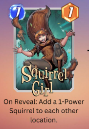
I have seen "Squirrel Girl" as an apparently game-changing card 3 games in a row now and still have no idea what it is/does
The same thing happens when your cards have their cost altered in MS.
You play squirrel girl and she spawns two squirrels. It's the most self explanatory card you've mentioned so far.
Have you not seen it played?
Not going to read that post - I'm waiting to find out what Squirrel Girl is from the game's animations

He just played Nightcrawler and the screen said "BAMF" in big letters and then nothing happened
It says what it does on the card

In HS this would've showed the card full-screen size for you to read the card's effect as it's played and then there would be lightning or something pointing to the card that was affected
It's prety obvious. there's no room to put text on the card.
I scrolled past the squirrel girl post, waiting for the game's UI to explain the card to me intuitively
There's no room to put text on the card because they filled it with ugly art and made the screen small and yet somehow it's still hard to see the art on the screen because they ALSO made the cards small on the board so that they could have tons of dead space (?)