Thoughts, stats, ideas
boreball

The mi neslta twins
1 Like
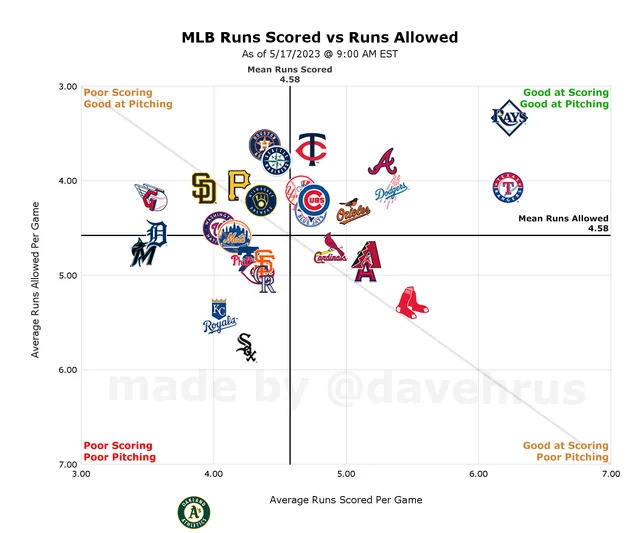
Thoughts: extremely ugly chart, lot of extra white space around the edges (zoom in more), move all the text that's inside the chart to an axis or footnote, the text on the inside of the chart space makes it look busy. There are also extra grid lines that serve little purpose except making the chart appear busy. In general the text placement is utter nonsense and makes the chart harder to read, takes longer to figure out what is actually being communicated, etc.
Also the fact of baseball stats being a pursuit exclusively for autistic people doesn't excuse you from making decent charts, the autism needs to extend to the chart construction also. So ugly
1 Like
thank you for the feedback but i didn't make the chart
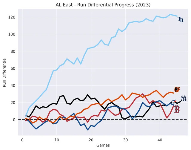
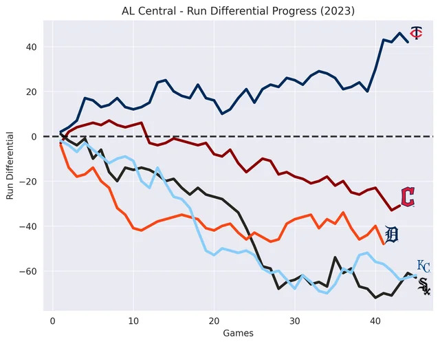
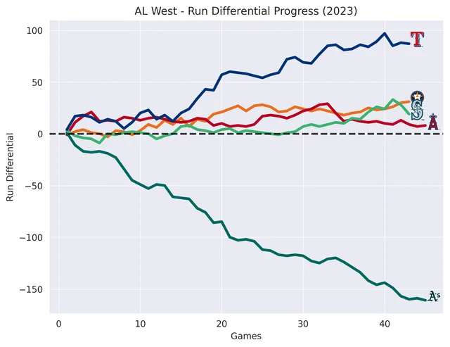
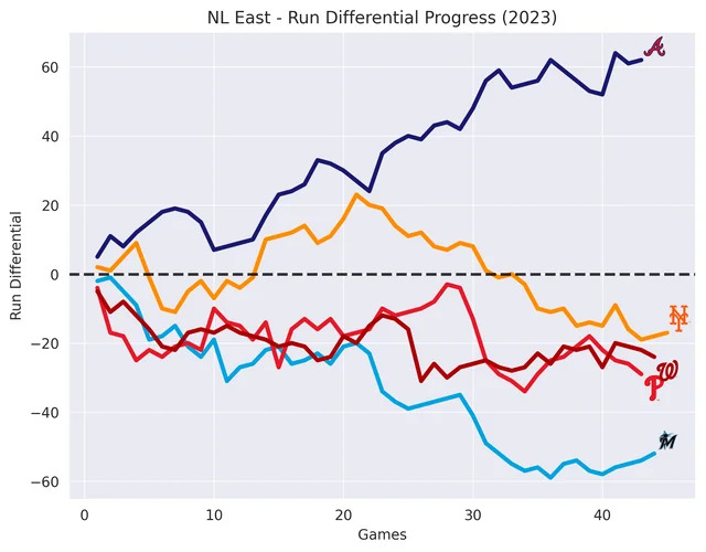
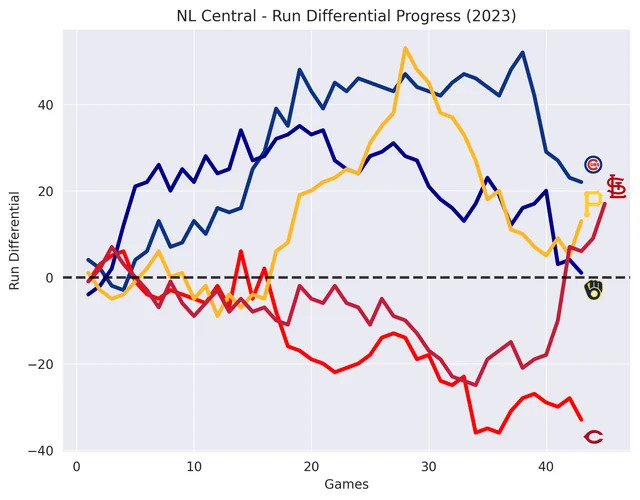
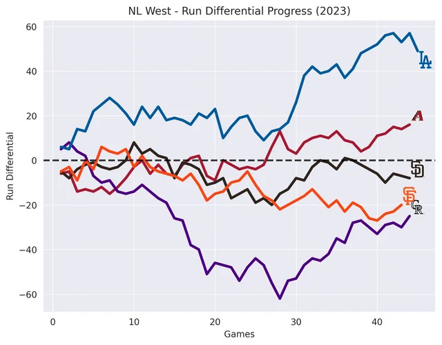
@big_ass are these any better?
Yes well done. That's ggplot2 i think
First one was probably mpl considering it was ugly as fuck
![]()
do you think the league will mandate head protection for pitchers after feltner's skull fracture the other day?

i dont like baseball
2 Likes
The twins losing the series to the tigers is not a good sign. Target field is looking nice tho, love the old white people chants they get going
Baseball is going on?
Lmao baseball sucks so bad
Wrong opinion
If baseball is so good why have i never heard it be called based ball
Because your father failed you as a parent
That was uncalled for I didn't actually mean that. I apologize