what?
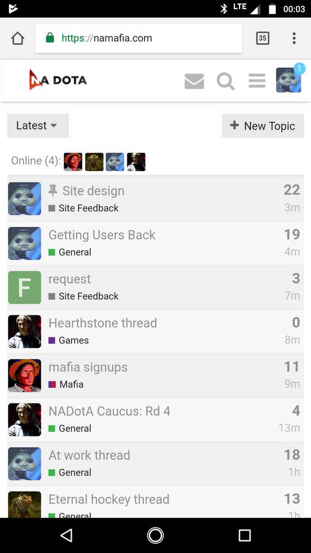
Really love how everything is in the middle and theres hude empty space to the left and right. Reminds me of al l my favorite websites like facebook and twiter
@SOPHIE, on the light theme, the background color of each thread in the list alternates between white and slightly grey. The posts should do the same.
1 Like
Disagreed
Idk it’d help differentiate posts a lot when you’re scrolling through, especially because the line between posts is the exact same as the line between a post and its signature
1 Like
looks like shit
let me know if you need help
Hello,
This is an automated message from NADotA Mafia to let you know that your post was hidden.
Your post was flagged for moderator attention: the community feels something about the post requires manual intervention by a staff member.
Multiple community members flagged this post before it was hidden, so please consider how you might revise your post to reflect their feedback. You can edit your post after 10 minutes, and it will be automatically unhidden.
However, if the post is hidden by the community a second time, it will remain hidden until handled by staff.
For additional guidance, please refer to our community guidelines.
I think the avatar and the “sharre edit reply” bar is enough.
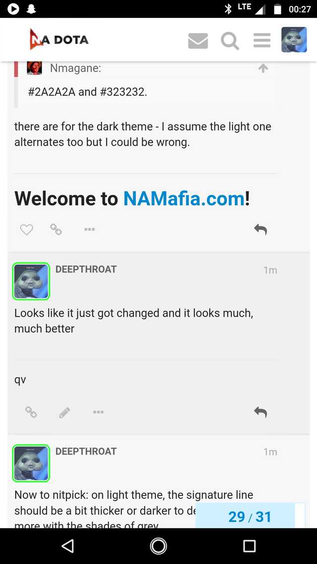
Plus - the posts already alternate color, it’s just not as obvious. #2A2A2A and #323232.
there are for the dark theme - I assume the light one alternates too but I could be wrong.
Looks like it just got changed and it looks much, much better
1 Like
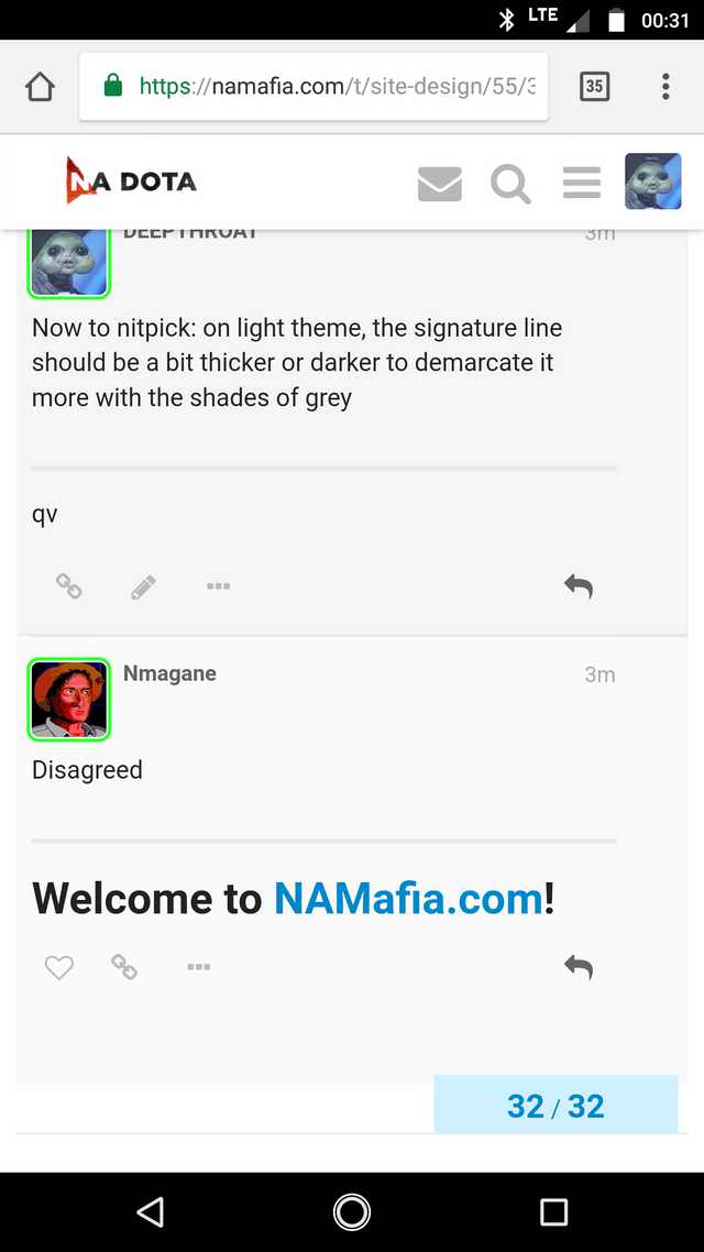
Now to nitpick: on light theme, the signature line should be a bit thicker or darker to demarcate it more with the shades of grey
1 Like
Disagreed
Thanks, @SOPHIE
1 Like
no problem
@Nmagane as for the design, i know its got empty parts to it but i plan on filling it out as we come along. we have a custom layouts plugin that i plan on figuring out how to use to make a sidebar from that’ll have useful information and links to boards.
i was thinking about getting rid of the timeline on the right and making post with be full, but the timeline feature might not be something i want to remove idk. definitely the easiest way to make the forum “fatter” or wahtever. im guessing you’d be interested in removing it?
Didn’t NADotA desktop have the same issue with tons of empty space? It’s one of the reasons I only used mobile, even on my computer
1 Like
Make it look like this https://www.youtube.com/watch?v=yCa6FqwD7b0
it did not before. and i dont choose the colors either. there’s a colorsheet in the back, i take the $secondary color (bg color definition) and use it for post/column/category bg with the darken sass function on light, lighten sass function on dark
Also, add postcount so I can see how degenerate I’ve been as I fiend this site
1 Like
Can’t embed videos?
Also this needs to be removed - I think its 30 seconds (Too much for mafia). NaDoTa had only 10 I believe.
You’re replying too quickly. Please wait 8 seconds before trying again.