The envelope is tied to quick message. If you turn it off, the only way to navigate to messages is to hit the profile picture then click show more. So, you’d have to read the envelope and have it direct to the main messages page, and then also add the links to display message notifications on it
Might be possible to fork the repo and have it so it adds the message icon (that would just be a link to /messages) if people opted out but generally figuring otu anything about how users opt in opt out and doing stuff around it leads to the same conclusion, we should make an internal plugin to set up the checkboxes for that instead of trying to put it in this component instead (especially since a lot of people seem to have different preferences)
found a good thread for it, will take a look tomorrow after modifying this guys theme component
we’d be able to do checkbox for large emoticons or non-rounded avvys too
╬═╬ Merdivenden aşağı inme ╬═╬ ╬═╬ Daha aşağı inmee ╬═╬ ╬═╬ ╬═╬ Düşersin bak inme ╬═╬ ╬═╬ ╬═╬ ╬═╬ Sinirlendirmee beni ╬═╬ ╬═╬ ╬═╬Devam etme ╬═╬ ╬═╬ ╬═╬ ╬═╬ Yoruldun mu yorulduysan inme ╬═╬ ╬═╬ ╬═╬ Biraz daha inme sonuçlarına katlanırsın ╬═╬ ╬═╬ ╬═╬ Sıkıldınmı o zaman inme ╬═╬ ╬═╬ ╬═╬ ╬═╬Yeterrrrrrrr ╬═╬ ╬═╬susssssssss ╬═╬ ╬═╬ İnme lannnnnnnnnnnn ╬═╬ ╬═╬ ╬═╬senin ben… ╬═╬ ╬═╬ ╬═╬ Öff sen bilirsin ama sonuçlarına katlanırsan ╬═╬ ╬═╬ ╬═╬ ╬═╬ ╬═╬ ╬═╬ ╬═╬ Hala vazgeçmedinmi? o zaman %100 BİR DELİKANLISIN 2 Saat uğraştım 1 like atarsanız çok güzel olur İnşallah bu yorumu beğenene sevdiği aşık olur amin! like atanın inşallah yarın ilk 4 dersi boş geçer
Yeah but it’s broken in my mobile and there is an option to default disable and each user can enable for themself . Also my menu is mega crowded on mobile now.
Also is the button working for you on mobile. Ever since they did the swipe change is the like broken for me.
I’m using chrome/ Droid.
The swipe change is awful, but it still works about 75% of the time for me.
agree on swipe. but if i click messages button on mobile i can’t get rid of it or if i can if i click on my profile or the menu button they are transparent. wonder if dan fucked with my css
 //potential fix to people being "frozen" in messages
.mobile-view .header-cloak {
    display: none !important;
}
dansgame
Oh, so, swipe away doesn’t work for me. I have to click to focus on something else on the left side of the page, if that’s what you mean
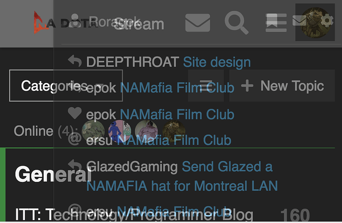
On mobile if i click the envelope, for quick messages. then i click off to go back to the screen. This doesn’t always work but sometimes it does. After that if i click my menu or user name in the rop right. those drop downs are transparent.
this only ever happens if i click the envelope for quick messages.
Oh shit this happens for me too. Never noticed the transparency issue before
quick messages doesn’t unset its inline css for me
opacity: 0.5; display: block; top: 0px; stays up on header-cloak.
You also can’t slide out the left bar after using quick messages (not that I’d ever want to slide it out, that only happens accidentally)
I would like to remove quick from top by default and have users opt in via user interface options. I don’t really feel the need for it anyways. Active messages show up under my user anyways.
Nice I was ahead of the curve
Not really.
No curve to be ahead of
